spotifi

Little Demon Guy!

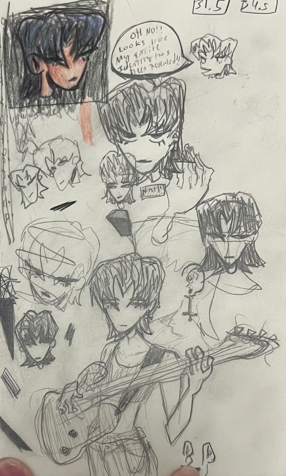
 Alright so I talked about one of the characters from my film, now let's talk about the second very important character. This here is the little demon guy you saw in the background of the previous post!

I love making these little thumbnails I even animated this one

Now this character is supposed to act as a representation and allegory of something. They stand behind and loom constantly over the main character of the piece, feeding her visions, disturbing illusions, and flashes from the past and possibly future. These are what carry the piece forward from scene to scene, functioning as a way to tell a story about the ways we try to protect ourselves from the harshest truths by feeding illusions to our own selves. This eventually cripples the main character completely, and causes her to face her literal darkest thoughts. Yes indeed, you have been spoiled, the lil demon was the main character all along (*shocked wow in the audience*)! 


I think this works pretty well as a story telling device as it personifies our darkest thoughts and repressed emotions, they loom over you at every moment, even while doing the simplest task, and eventually cause you to break down completely. I settled on this design after experimenting around with how I could visually portray these thoughts and emotions, I wanted something that was easy to draw but still had lots of character and expression. I got inspired from many things to create this design, for example I looked at Oyasumi PunPun, a dark drama manga by author Inio Asano that has many examples of effective horror character design that is still simple and easy to tell apart. Below we see an example from this. The dark yet simple silhouette of the figure makes it stand out from the background, however there is still detail that is housed in the blank eyes. The eyes honestly fill me with a little bit of dread, it feels like they are staring into my soul.


Eyes are actually something that I really focused on for this character, I think they can act as an effective form of symbolism. Eyes can represent being looked down upon, whether by other people or by yourself. They also work as a way to showcase the mental state of a character. Sometimes, a lack of highlights in the eye can even tell you if a character is alive or dead, either literally or metaphorically. We can look at an example like Something from the indie psychological horror game OMORI (something is literally its name!). Now I know that this is yet another dark silhouette figure with an eye in the middle but it just works so effectively! The best thing about this kind of character design for me is that it can mold and change into whatever you want. Below we see examples of all the different forms of Something. The first image shows how it usually looks, constantly stalking the player character. But throughout the game, this figure manifests into different amalgamations that haunt the player character. This acts as an effective way of communicating to the audience what the player characters fears are, and they also scare the shit out of you! At the bottom of the page I also included a scene from the game in which Something appears as a boss enemy, it's a great example of not only amazing horror visuals but also spine chilling sound design. 


I took inspiration  from these characters for my character, and I also added in my own little touches. Their wings and horns are something I though up, showcasing this guy as a little demon communicates to the audience that this is in some way the main characters own emotional baggage. I also made sure the the horns are an aspect of the character that is used to express emotion. Near the end of the piece, I want to have a scene where the main character accepts the demon, and because of this their horns form into the shape of a heart, showing that the acceptance is mutual (how cute!). Their design ,similar to Something, is also malleable and can form into shadows, different representations of the main characters emotions, and nightmarish amalgamations of her deepest fears. They also are constantly hovering above and behind the main characters head, telling the audience that the main character is always suffering with these negative emotions. I will be making a second blog post with a more detailed design breakdown and character sheet of the little demon guy, and I will make sure to keep my inspirations in mind when designing their final look. 

Telling stories autobiographically and Lesbian Experiences with Loneliness

 God, what a title. Alright, one second let's recuperate a little bit and refocus. Today I wanted to talk about an author's works I read a little bit ago that kind of opened up my eyes to just how important it is sometimes to be as open and honest as possible when creating art. Not only that, but her works also showcase the importance of telling your story when it needs to be told, plus the need to always document what is going on with your life as it will help you remember important details in the future.

Kabi Nagata's My Lesbian Experience with loneliness is a short comic that outlines the author's experiences with love and loneliness in Japan. The work covers over 10 years of Nagata's life and sets out to reveal all the different ways that the author coped with loneliness and depression after losing "a place she belonged to".


The work then goes on to talk about how often, we are expected to follow a set of metanarratives laid out by society, and when we fail to do so we are looked down upon for not being able to meet them. What I appreciate so much about this work is that it lays out these ideas by simply talking about the effects that these expectations have on people and the ways that it makes them devalue themselves after not being able to meet them. Eventually, small things like getting out of bed or brushing your teeth become massive challenges that feel rewarding when you complete them, however, everyone else around you just sees it as lazy and unaccomplished. 


Eventually, the author realizes that she is not taking care of herself due to trying to meet these expectations placed on her that she could never follow. Once she stops prohibiting herself from experiences and ideas she once thought she was forbidden from, she starts to care more for her own self. She gains an appreciation for how important it is to openly embrace yourself and take care of the only body that you have. There's a specific part about "The me trying to please my parents" that really resonated with me in a lot of ways. I think over the years I have found that I tend to be the type to try to please my parents and follow their expectations for a studious and respectable kid. However, I have recently abandoned that mentality and my appreciation for myself has completely skyrocketed. I no longer have the same lack of care or attention for myself I used to have, similar to Nagata.


Now Nagata's story continues with her attempting to find love and affection through engaging in Lesbian sex with a prostitute, which is very cool! But not how this story applies to me. If you want to hear how that story ends then I suggest you check out her work it really is quite unique. Instead, I want to finish this blog by showing a panel from one of her later works in which she talks about how sometimes a story is so important to tell that you just can't stop yourself from creating it, something that for this project has been very very important for me. For me sometimes it feels like I lose all my ability to create, like I have said all I have to say, and like my stories are all going to be bland and boring now. But then recently it all kicked back into motion for me. I don't think I have been this happy in years, and it has brought back things into perspective for me and allowed me to create again! Similarly, after the release of My Lesbian Experience with Loneliness, Nagata fell into alcoholism and depression again after she made her parents be disappointed in her for writing about her experiences. She promises to never write autobiographical works ever again, however, this makes her unable to produce stories that are as interesting and impactful as that previous work. Only once she takes off her own mental limiter is she able to regain herself and come back stronger! 


Animation for the Internet, AKA I have to animate 4 minutes T~T

 Doing animation for the portfolio project comes with one big issue that is really difficult to ignore, TIME! For animation, I have to do 4 full minutes in the next month or so, I not only have to start production basically this week but also I have to look at other projects similar to mine to see what their little tricks here and there were to get something like this done in a short amount of time. For that, there is no better thing to look at but CalArts short Films and Internet Animation!

i drew a lil thing as the thumbnail!!!

Alright so first I wanted to show an example of a film that I think is a great example of working with limitations to meet a certain time requirement. Vewn is an animator who already graduated from CalArts and produces little short films like this one for her patreons. Her style is very loose and surreal yet still grounds itself and is easily readable.  This film was produced in about the same time as our portfolio project and is right at the 3 minute mark. While this isn't the time requirement I need, I have a couple tricks up my sleeve that will help me get there. Not only that, the pacing of this film is absolutely balls to the wall so I think I can take some time for some scenes to just slow down and it should all work out pretty well. This film uses very simplistic animation to achieve a very specific and deliberate look, meaning that less attention has to be paid to the quality of every single frame but the animation still remains very dynamic and active. This film serves as a great example of how to work with limitations while keeping a conscious art direction.


I'm not going to lie this next film is straight up fucking weird. "Temptation Stairway" is a short film produced for the internet video series ENA. It follows a set of recurring characters that show up in different scenarios, but besides that, this entire series is a lot of niche internet humor and post modern storytelling/antics combined into one really really weird acid trip, and that's what makes it so interesting. A lot of times, creators on the internet use these weird storytelling techniques to save themselves time and effort they otherwise would not have. This has almost become a convention of internet animation and not just a recurring theme. It is something we are even starting to see popping up in tv animation, with shows like Adult Swim's Smiling Friends exemplifying this with its short attention spawn pacing and overall lower quality animation. However, in both of these scenarios, this is still done deliberately. The whole point of the joke is that it looks like it's ripped out of a PS1 era videogame or out of a Newgrounds style animation. They both use their limitations to appeal to a certain look that their target audience will appreciate. While this might make these pieces a little alienating for some viewers, the goal of these works is not to attract the largest audience, rather it's to get a specific in group that will really appreciate all the little easter eggs, gags, and style differences that these pieces offer. Anyways, here is Temptation Stairway and also a clip from Smiling Friends just for reference. 


I'm going to talk about one more to wrap this up with a cute little bow. This one is another CalArts film from one of my favorite creators out there! Mobbele is another CalArts graduate working at Netflix animation. This little film is way closer to what I should be approaching in time, and while it doesn't use as many shortcuts as something like an ENA animation, something I take away from it is just how nice their compositions are to look at, both shape and contrast wise. I'll be keeping pieces of animation like these in mind as I go forward with the project, and I hope they will help me out when it comes to deciding my art direction and how I am going to pace my story. Anyways, here is "gone astray"!


A Level Portfolio Project Animation: Art Process and Breakdown!

 Alright, now that we got the formalities out of the way, let's talk art and stuff! I'm starting pre-production on my Animation piece for the portfolio project. I'm going to be talking a lil more about story in a later blog post, as I'm still sorting through a lot of that. For now though I want to show you guys a little bit about the character I have in mind and some of the concept art and sketching I have done for her! 


Let me introduce you to!!!!.......Well, I don't have a name for her, it's a bit of a complex topic that I can't talk about yet. A lot of this project is going to be largely autobiographical and is something I'm still working through currently. I'm going to be revealing quite a lot about myself, my personality, my identity, and my struggles so I want to make sure I cover each of these carefully while also giving myself the ability to figure this stuff out on my own. I think as the project develops, a lot of you will be able to piece together what this whole thing is all about, and I think that's kinda the point. I want to be as open and honest as possible in this blog, it's kind of working as a way for me to work out all of this mess, but that's going to require me to be a little more comfortable with the direction I'm taking before I do that. GOD THIS SOUNDS SO CRYPTIC, I promise it will make sense soon. For now though let's forget about this dark stuff and talk a little more about my art process.


So how did this character come to be? Well it all started out with a lil doodle I did while sitting around in math class (I swear it helps me focus!). I, for some reason, really attached myself to this lil doodle. I took her and tried to give her some more personality by putting her in my sketchbook and trying to develop her character a little bit more. I did some sketches in some sort of action and also tried to figure out what type of outfits she would wear. She became very easy to draw and was quick to tell apart and recognize, something super important for animated characters. I developed a scene she could be in, put her in a 3d environment, made her a pixel art talking animation, wow I did a lot for this character now that i look back on it. Then it all clicked together for me.


This Click together moment is something that I'm going to keep on talking about, its the moment when all the disjointed ideas and concepts in my mind and in my work suddenly aligned together, and it all happened when I had one huge, but incredibly scary realization. This is something I want to cover more in depth in my story post, as it relates a lot more to that. But basically, this character was not just any throwaway character, it was a manifestation of something fighting back inside of me that wanted out. A way for me to express my inner self when I couldn't outwardly do it myself. I think a lot of you probably understand what this is about and what direction I'm going in, and for those who don't well, I'm not going to tell you just yet(it's scary!). 


Anyways, since the start of this week, I have been doing some more concept sketching for this character
and another which I will be talking about soon. So far I'm v e r y happy with how she's turning out, and while the work is not finished I still have gotten the chance to experiment a little with the art direction of the piece. Now of course I am not going to be this detailed and experimental when doing the actual animation, I simply don't have that time and budget. However, this gives me the chance to at least figure out the direction I wanna take this stuff. I'll talk to you guys a little more about the lil demon character you see in the background as this lil goober is just as important, but for now, thanks for reading and I hope you all are just as excited as me to see this!

So what have I been up to? (Part 2)

 As I said in my last blog post I wanted to talk about a project we did following the Documentary project. The Film distribution project focused on getting us familiar with the intricacies of film distribution and how they impact the ways that a film gets out to the public. My group and I had to produce both a teaser and a trailer for a film, along with a presentation that explained our marketing plan and distribution tactics. 

The "film" we made was based on a short story written by one of the students in our creative writing class. It told a tale of a mountain town where it always rains, everyone is tired of the rain and therefore does nothing about it. A 10-year-old kid decides he will take the lead and ignore the rain, but because of this the mountain becomes enraged and chaos ensues. The story mirrors real-world themes of ignorance to social problems, specifically Covid-19 and climate change. This gave us ideas for the ways that we would distribute the film. We researched social commentary films similar to this one, Parasite and Don't look up were our two case studies, and found some interesting information. Social commentary films usually distribute their films to smaller places at first such as festivals and events, this is the case for Parasite which was first released to smaller film festivals and then distributed more widely after being picked up by a distributor. We thought this would work for our film since the main approach was to get the film out to as many people as possible. Don't look up went the way of digital distribution, something that we thought would work similarly for us since our target audience prefers watching films through digital mediums. 

The teaser and trailer production went a lot smoother than we were expecting, even though for a majority of it we were practically rushing through. We had a day before filming where we did all the blocking for the piece, and this really saved us when it came to editing as we found out that we simply did not have enough footage, which allowed us to create more shots to fill the 2 minute total run time. Filming went mostly fine except for the unexpected weather conditions outside. We live in Florida, so we were really not expecting freezing weather outside, especially when we had to fake rain. We fought through the freezing "rain" and even though our hands almost shattered to pieces were able to get all of those scenes done. When it came to filming outside, one-shot gave us a lot of trouble. We needed to have a scene with an old tv box displaying an analog signal, but we simply did not have any of these things. No worries though, technology to the rescue! I used the 3D Lidar scanner on my phone to create an accurate 3d scan of the living room of one of my teammates. I then imported this into the 3D program "Blender" and imported and textured a 3d model of an old box tv. After figuring out some lighting things, the shot was finished and it looked like it was not even fake!


Working on this project went a lot smoother than our previous projects, and I think a reason for that is that we went about it in a more relaxed manner. Instead of stressing ourselves with making the best piece possible, we instead focused on having fun creating while still maintaining ourselves on task. However, it would have been good to apply ourselves just a little bit more so that we weren't rushing by the end. You can check it out here!


So what have I been up to? (Part 1)

 Over the past year, we participated in multiple projects that developed our knowledge and understanding of various mediums and forms of distribution. I wanted to talk about two of the major projects we did this year, what I learned from them, and the ways they changed and impacted what my approach to the portfolio project will be. This first posting will focus on the Documentary production I worked on along with two other group members, and the posting after that will focus on the Film Distribution project. 


For the documentary project, my team and I decided to showcase the relationship that teenagers around our age have with clothing and the different ways that it affects how they identify with their gender and its expression. It was a big topic we were all very excited to talk about, and our team got together an amazing set of interviewees for the production. Throughout the weeks of production, we handled all sorts of new equipment we had not used before and experimented with different creative ideas for ways we could shoot b-roll and whatnot. I also got to see just how important delicate and explicit planning is for a production and how it can save you later on. When it came to editing, we got to experiment with new tools for things like color grading and looks, but this also came with its problems when we did not realize we were grading the footage for HDR video, making it so that it looked pretty horrible on all other screens but ours, meaning we had to scrap that idea and recolor quickly. (these frames look amazing though!). You can check it out here


Working on the Documentary was both a revolutionary experience and a very eye-opening one. We finally got the chance to work on a long-term production for the first time in the year and we had settled on a documentary topic we were really excited to tackle. Throughout the process, I got to see real-time how solid planning and thinking forward were the only things that allowed us to finish the project to the level of expectations we had, and that's something that I couldn't have done without my teammates. With that said, however, this project specifically opened up my eyes to how much my creative freedom was important to me. There are many creative directions that were shut down during the production, and from the interviews we had gotten, I still feel like there's a story underneath what we failed to capture simply due to not experimenting enough with the final concept of the film or thinking about its impact more broadly. 

I also find that when working in groups for projects like these, a hostile and competitive environment can often form when everyone should instead be working together and communicating openly about the different issues going on. A healthier approach that a couple of my peers and I thought about was simply helping each other out but not necessarily attaching ourselves to the same project. That way, the final result and direction of the project are left mainly to its lead, but they can still rely on the help of their peers should they need it. I think this will most likely be the approach I take in terms of partners for my portfolio project, it's honestly a very very very personal topic and story, and it would honestly not make much sense to allow anyone to change that. However, with a project of this scale, I think it's always important to rely on those around you to at least keep you from going insane.


Welcome Back to the Show!

 Hey everyone!


So after last year's adventure with the AS Level portfolio project, it's around that time of the year yet again, except now, I'll be taking on my A level Portfolio project! I'm very very excited for this project as last year it quite honestly redefined and expanded on not only my abilities but also just on myself as a person, and I think especially with the subject matter I'm thinking of tackling it will be a very new and enlightening experience for me. Come and join along for the ride!


I'm so tired

Ok, so I have been Grinding the hell out of this project.

Like, a lot.

So then what have I done so far?


I finished a lot more of the shots that I was missing beforehand.


I also modeled the entirety of the inside convenience store and I am honestly super happy with how it came out.


I'm almost done with animating and then I'm going to go Composite all of this in After Effects.

But I'm pretty dead so I think ill sleep for the next 48 hours straight.


Finished shot


Alright, so I'm tired as hell and have been working way too much so I'm gonna post the one rendered thing I have for today and enjoy my spring break for a little bit. 

As you can see, a lot of changes have been made with the store plus the overall lighting and composition. Now I only need to add the character in so I'm pretty happy with how this is all turning out.

Character Design


Ta da! A character Design Sheet!

I liked where I was going with the design of the character in one of my previous blog posts, but it definitely felt as if I needed something to have around to reference.

 A friend recommended me the name " In my Head" since the film is all about intrusive thoughts. I thought this was pretty good so I added it for now to at least identify it and ill see if I keep it later. When I sat down and sketched out this first draft of the design today, I felt as though it is still lacking in some ways. 

I envisioned this character being portrayed as a punky, outlandish, and bashful young person, but only when we are looking into their thoughts. In reality, they are genuinely kind and just have a lot going on to handle. 

To solve this, I think ill rework the character a little bit by pushing the design elements to be more exaggerated. I have always heard from industry professionals that, especially in animation, pushing proportions and exaggerating design are two key components to enhancing the visuals and portrayal of a character and story.

So for example, I can add a big round smiley face onto their shirt covered by the jacket to show that they are open to being kind but have to get out of their comfort zone to do so. I can also make their outward design to be sharper with things like the ponytail. 

Right now I'm working a lot on the backgrounds and 3d models so that's what my next blog post will probably be about.

Storyboards


A professional artist's storyboard is usually clean, precise, and overall readable by everyone. However, professional artists also get paid and have time, two things which I for sure don't have (basically I'm broke on time and money :P ).

 Even though I would love to invest a sizeable amount of time into a good storyboard, I simply don't have that luxury when working solo.

This means I have to adapt to working loose, quick, and dirty. The storyboard you see here is not one that is top-notch or the best by any means, but it for sure gets the job done and helps me to actually continue moving forward at a much faster pace.
Storyboard.

Now that I have this, my next post will probably look more into character design or will showcase what I have worked on in terms of animation, see you next time! 

A quick little sketch.

I have been grinding away at the general environment, characters, and props needed for the piece. However right now most things are pretty unfinished except for this one shot that I still think needs some work. 


A merging of both 2d and 3d Elements.


Here you can see how I have started to work on the shot of the Vespa coming into frame. Not only that, I am combining 2d and 3d assets to create the look that I want for the film. This look is still VERY EARLY, especially in the rough sketch of the character and the direction they are facing. 

Next, I need to get that storyboard quickly as it will be key for helping me finish this.

I have a lot more that I have worked on, but again it's mostly stuff that needs polish before being shown, so ill just leave some progress renders showing how I got here.

First pass

Developing Composition

Vespa + Store

Very rough Character Sketch

Different angle + Final Render Before Composite


All in your head.

 As I said in my previous blog post, I will be going over the story told in the first 2 minutes of my film.

The scene will start off with a shot from the outside of a convenience store at night time. From the left side of the frame, a girl on a Vespa will drive in and park on the side of the road. The scene will cut to her about to open the door of the convenience store from a medium shot, then going into a close-up to show her pondering. A security camera angle will show her walking in from the door, then cutting to show 2 store clerks having a small conversation.

From here, we cut to the two store clerks continuing their conversation in the foreground while in the background the girl picks up a heavy ice cream cabinet and swings it towards the clerks, barely missing them ( a most likely rock/punk soundtrack should come in here). We cut to the girl going towards the back of the store with all of the freezers and breaking each and everyone with a baseball bat. The clerks run towards and plead for her to stop, only to be thrown milk jugs at (I know this all sounds absolutely crazy but just bear with me that's the point). The girl drops the bat and suddenly takes a Katana out of nowhere, stabbing multiple milk jugs, grabbing and throwing one of the clerks towards the counter, and putting the jugs down to pay. 

We then see a shot from inside the store facing out towards the clear glass door, showcasing the girl still outside witnessing all that is going on. We cut to the same close-up of her pondering, and then see her go in normally, grab a jug of milk from the back, and pay up normally. The title of the film flashes across the screen and the film opening ends. 

The Scene is supposed to immediately introduced the audience to the main character and what the film will be about moving forward. Not only that, it allows for great opportunities for visual comedy and slapstick humor. 

I think ill try to work out some sketches and shots for my next blog post, and a storyboard will definitely be needed asap.

Finally figuring out a story

 So far, I haven't put too much attention on the actual story of the piece, so I'm going to talk more about that in this blog post.

A while ago, I started developing the look of the film by searching for visual content that I thought would match what I wanted to make. A lot of it was very surreal and experimental looking, so I knew that the piece would most likely tackle more psychological topics. 

While I knew the visual look that I wanted to achieve, I didn't really know what story I wanted to tell. Being inside due to Covid for such a long time really drains down your creativity, and while I could have told a story about that, I just didn't feel as though the look would match the story (plus I had already told this story about isolation so many times through other mediums like segments and PSA's for my tv class.). At one point I even considered going for a completely different style, following a more ghibli-inspired slice of life story, and I even came up with a tile, that being "Shroom Collector Poyo". While I won't be producing this story, I definitely will save this idea for later as I really like the tile and the visual look it could have.

One day, my friend and I were talking and venting about different problems we have had with disassociation and the such. We eventually got to talking about intrusive thoughts, which quickly popped an idea into my head about a story on extremely vivid intrusive thoughts and how someone could handle that.

This works out perfectly for the look that I want since these thoughts getting played out visually in someone's imagination gives endless possibilities for visual storytelling and trippy visuals. Not only that, I think it's an important topic to explore since the declining mental health of various young adults has most definitely increased the number of people who suffer from this.

Next blog post I will be going over what I plan to put in the 2:00 film opening.


2d Stylization for 3d creations.


 The closer we get to the day of submission, the more I start to realize that I will not be able to render this is in a photorealistic way as it will simply take way too much time. Because of that, I started to research some ways to get over this problem and found that stylized shading would solve my problem. So I sat down and developed some stylized shaders and renders that make 3d look as if it were 2d. 


I took an already existing character from one of my favorite animated music videos and got to work. I started by poly modeling the character and adapting them to be suitable for stylized shading. I also again used a reference board to plan everything.


Wireframe view of character.


I continued by developing materials and lighting that worked for the goal I was heading for, simulating the look from the characters in the music video. Flat colors and line work were two things that I was sure I wanted to nail for the character.

Stylized viewport shading.


Now that I had nailed the look of the character, I rendered it out as a turnaround animation and put it into after effects for compositing. I added a background and made it turn with the character. Then I added some film grain effects and softening to help clean up the overly perfect look that 3d gives.

After Effects compositing.

And it's done! This was a complete contrast from the last study I did, but overall a very worthwhile one. Now I'm sure I won't have to worry as much about rendering, and I know that for more still things like backgrounds I should be able to use a more complex look as it will all be mostly composited together in the end. Anyways, here is the final product!


Color Studies and Spooky Demons


It's about time that I start experimenting with visual ideas for my Film Opening, so I sat down for a bit and created a lighting and color study following the inspiration from one of my previous blog posts. 


First, I used a program called PureRef to put together a reference board with all of the inspiration I gathered. PureRef is great since it will always stay over your program while working so you will be able to reference it at all times.

Reference Board 

I wanted to go for a color palette consisting of a very violent red as a Primary color and a more subdued yellowish green as a secondary. My idea for the piece consisted of a figure looking towards the audience semi-menacingly. While my goal for this piece is to develop color and lighting, and this figure doesn't necessarily have to relate to my film opening in the end a friend talked to me about how I could have this figure be revealed at the end of my opening to be hanging over the entire environment and have it be some form of foreshadowing or world-building. 

I started out by blocking out the figure. I thought it would be interesting if I used skeleton pieces from different animals and humans to make up the figure, so I got a few models of whale and bear skeletons and started to kitbash from them, placing them together to make something interesting. 

Beginning sketch of the piece.

I continued by adding the arms, some horns, and a thorn sticking through its head. Then I started to mess around with materials, adding a semi-transparent subsurface scattering effect. Subsurface scattering is an effect you see when light scatters through a semi-transparent object (you can notice this effect when light hits lighter tones of skin.)

More Developed Lighting and Materials.

While I liked the Subsurface effect, there was not enough contrast for you to be able to determine what you are looking at, so I started to tone down the effect and played around with other settings.

Clearer Contrast

I added a background and a foreground element to help with leading the viewers eyes to the subject. Not only that, I brought back the Subsurface Scattering  but this time not so heavily. I also added some glows to the horns to give a more dramatic effect. 


At this point, I was pretty happy with where I was headed, but I felt there were some changes that I wanted to make that were more simple to do as a paintover in photoshop, so I jumped into the program and started to give the piece a more stylized look. I added additional shadows to the eye sockets and started to give the piece a softer painterly look.

Photoshop Paintover

I finished off the piece by adding some outlines for that stylized look and gave it some glowing eyes and an upside-down cross to make it look even creepier (Somewhere along the line this turned into a horror piece and honestly I kinda love it hahaha). Now here is the finished piece!


I learned a lot about color and lighting throughout this experience and even got some inspiration for possible story elements for my film opening. 


Little Demon Guy!

 Alright so I talked about one of the characters from my film, now let's talk about the second very important character. This here is th...